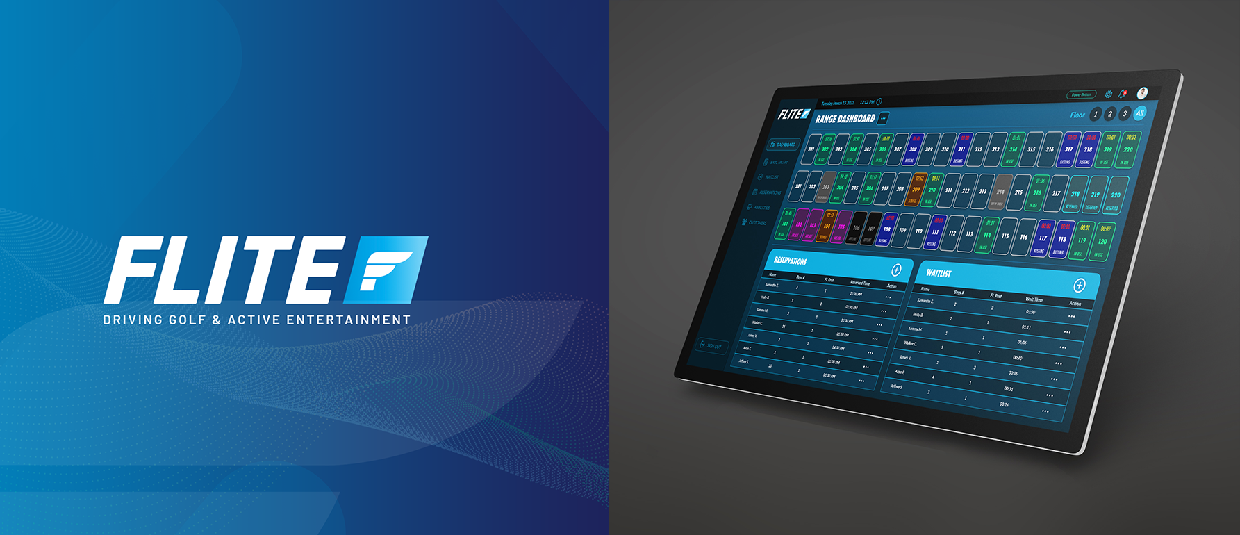
context
Working with three clients who recently opened golf venues similar to TopGolf, we were presented with the challenge of creating a seamless range management software to enhance their operations and improve the overall experience for both their customers and staff. As a UI/UX designer, me and the team were responsible for understanding the clients' needs, conducting thorough research, and developing a solution tailored to their unique requirements.
Problem Statement
Golf facilities often face challenges in managing their operations effectively without an advanced management software. leading to subpar customer experiences and lost revenue. These venues need a modern system to handle reservations, waitlists, and data-driven insights while prioritizing customer needs. This project aims to develop an innovative range management system to streamline operations and enhance user satisfaction.
Collaboration & Research
I worked closely with the project manager, CTO, and engineering team, we established a collaborative environment that allowed us to effectively define the project scope, develop user flowcharts, and create personas and information architecture. This cross-functional collaboration ensured a smooth design process and allowed us to address any concerns or obstacles as they arose. We conducted extensive research to understand the different scenarios that staffers might encounter during their daily operations. Some examples included managing reservations, managing the waitlist of walk-in customers, maintaining inventory, and tracking customer preferences. This research provided valuable insights that informed our design decisions and helped us create a user-friendly and efficient system.
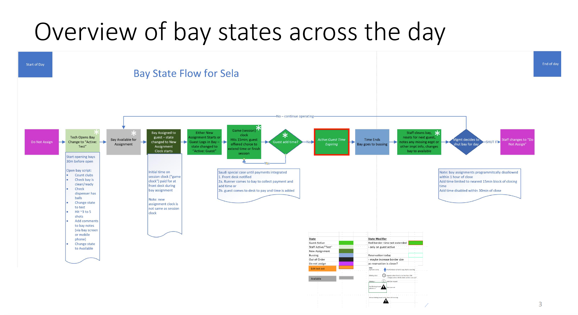
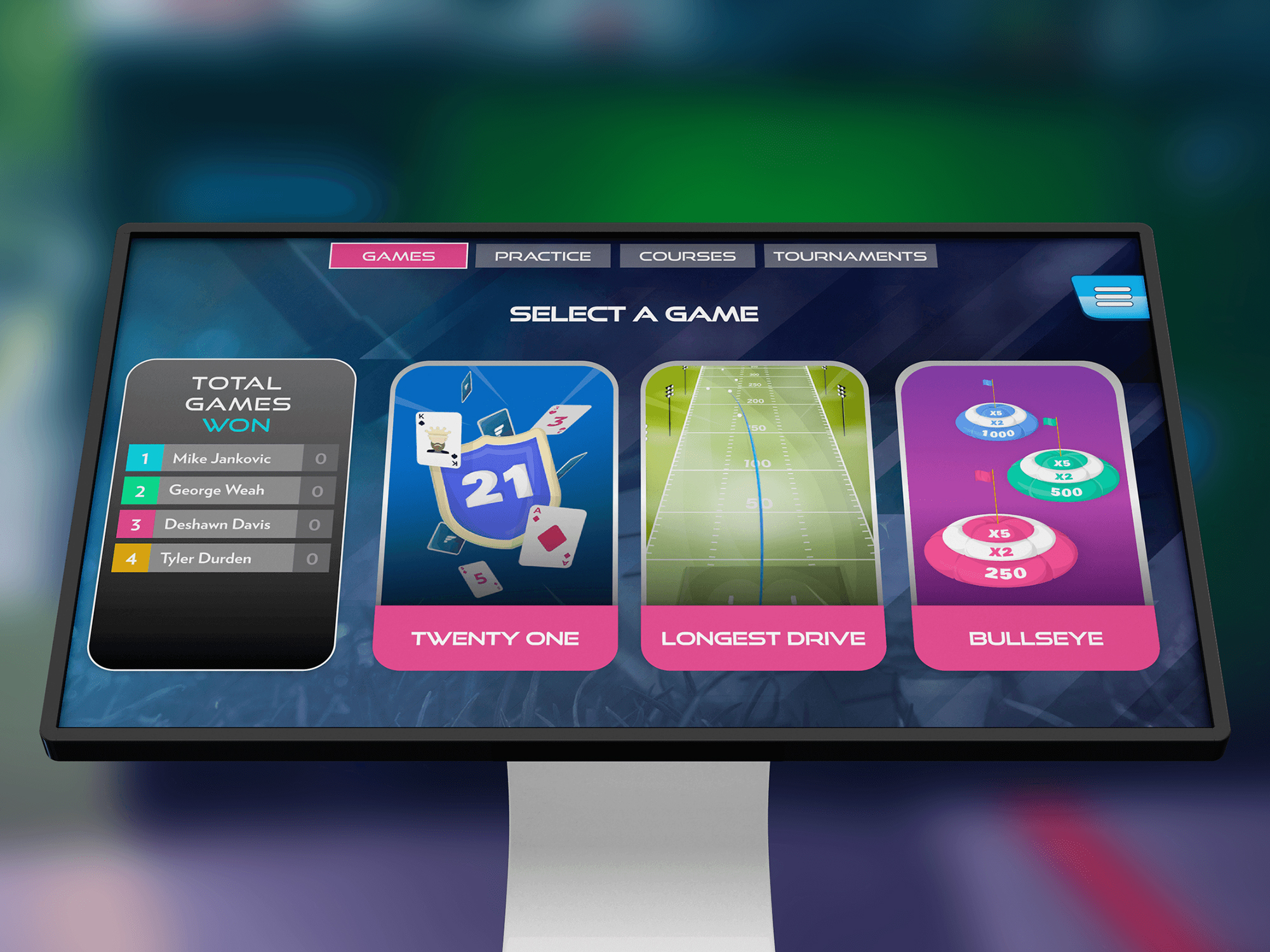
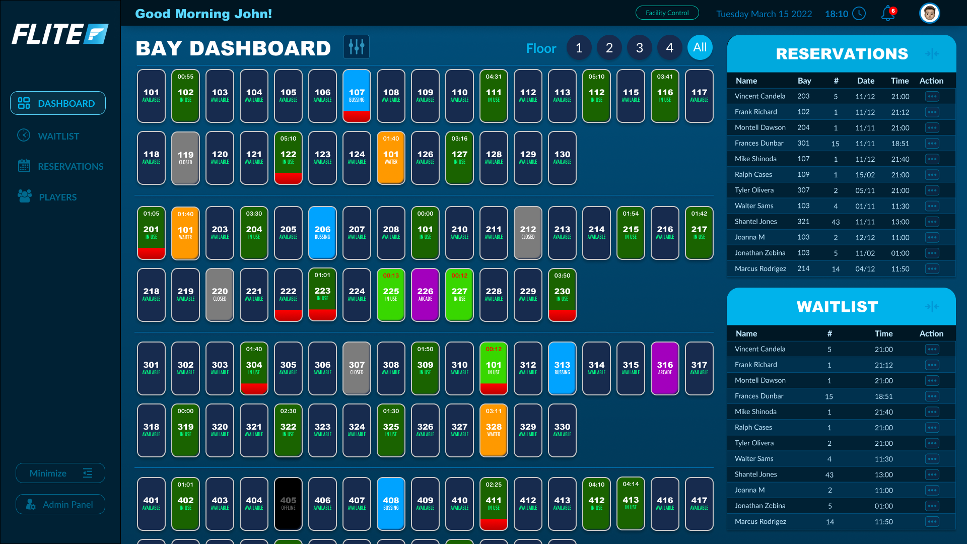
Overview of Bay States Across the day
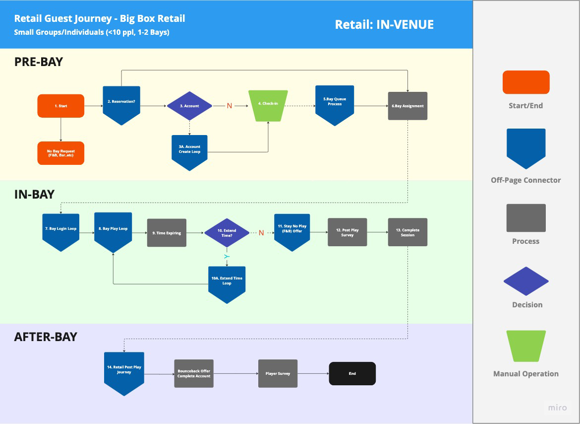
Retail Guest Journey
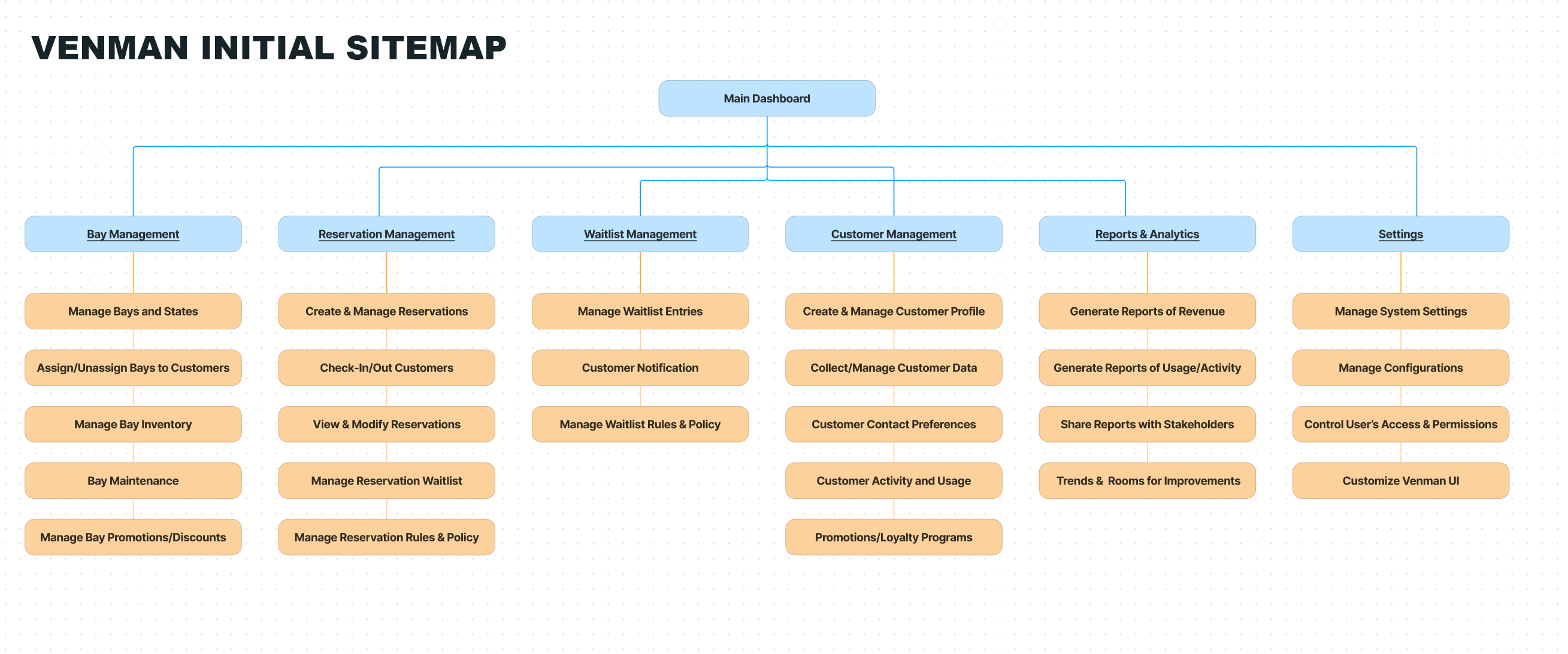
VENMAN Initial Sitemap
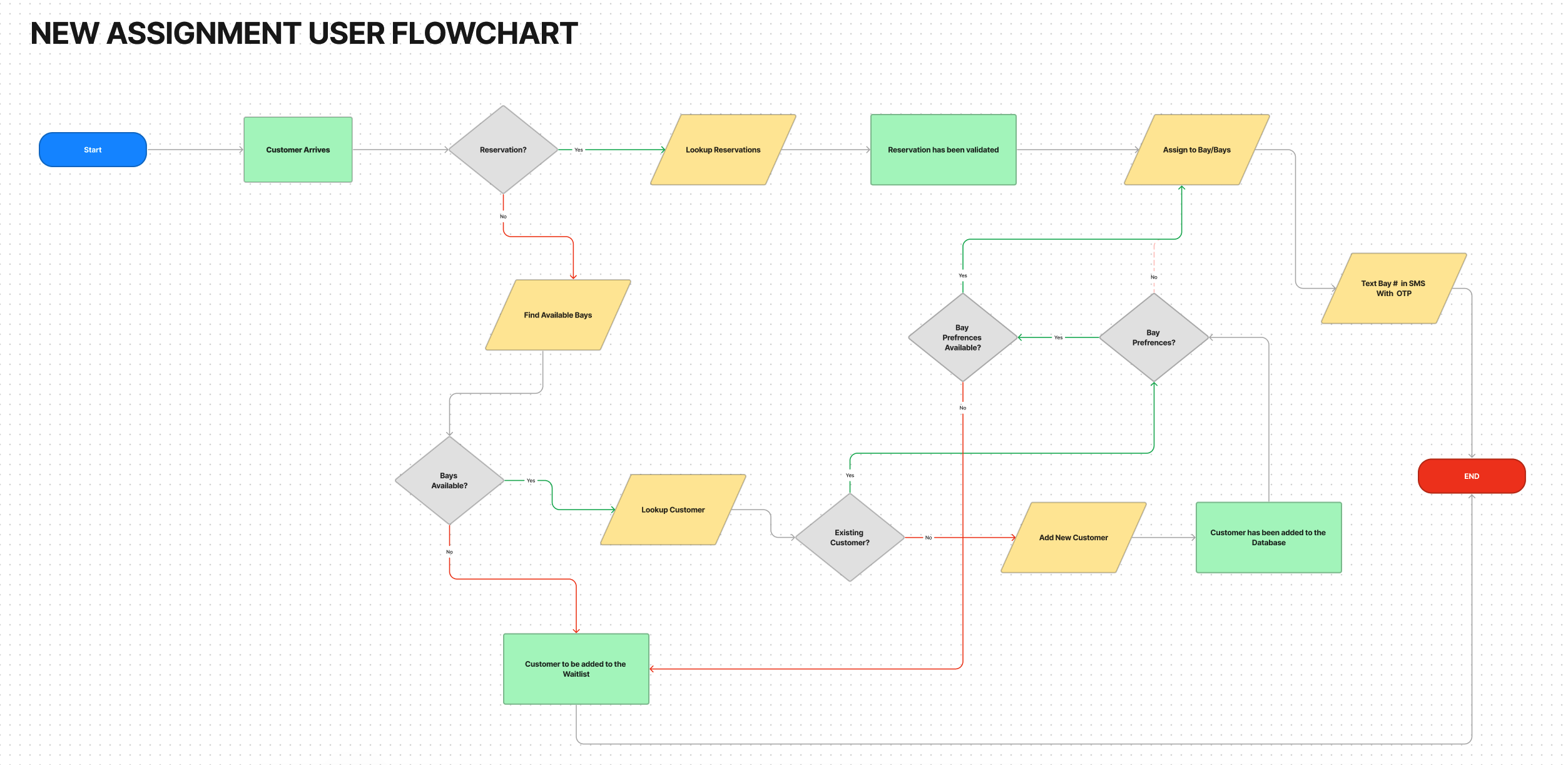
Assigning new customer to a bay User Flowchart
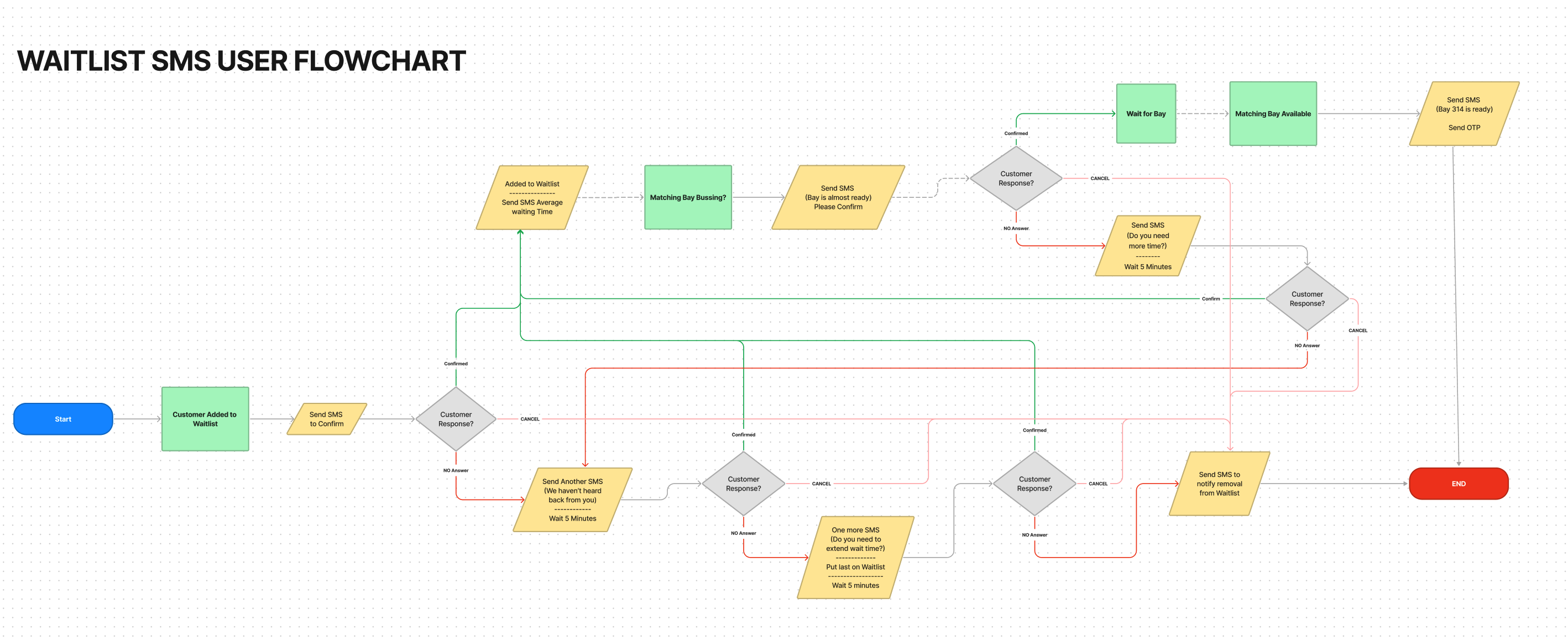
Waitlist SMS User Flowchart
wireframing and design process
To ensure a successful outcome, I approached the project by first creating Balsamiq wireframes that outlined the structure and layout of the software. These wireframes served as a visual guide for the team, helping us to identify and address potential issues early in the development process.

Initial Venue Manager Concept - Built in Balsamiq
Another Suggested Venue Manager Concept - Built in Balsamiq
To facilitate user testing and feedback, I developed clickable prototypes that enabled the team to test the product in various scenarios before implementation. This iterative approach allowed me to make adjustments and refinements based on real user input, ensuring a more polished final product.
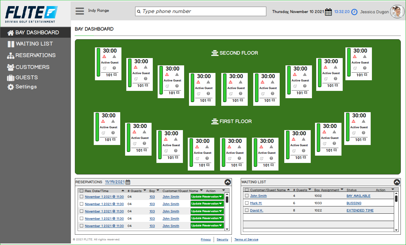
Venman First Version Launched at Sela (First Golf) - Built in Adobe XD
Given the tight deadlines, we decided to develop two different versions of the software: an MVP version and a more refined, second version. The MVP version allowed us to launch the product quickly to our client "First Golf", but it also required us to cut some corners and make some compromises in the design process.Upon implementing the MVP version, we gathered feedback from shift managers and front desk staffers who worked onsite. Their valuable input helped us identify areas of improvement and understand their frustrations with the initial version.
Improvements in the Second Version
Armed with the feedback from our clients at Sela, we took the initiative to address the problems faced by the users in the second versionof the software. We improved the user interface, streamlined workflows, and incorporated features that wouldenable staffers to perform their tasks more efficiently.
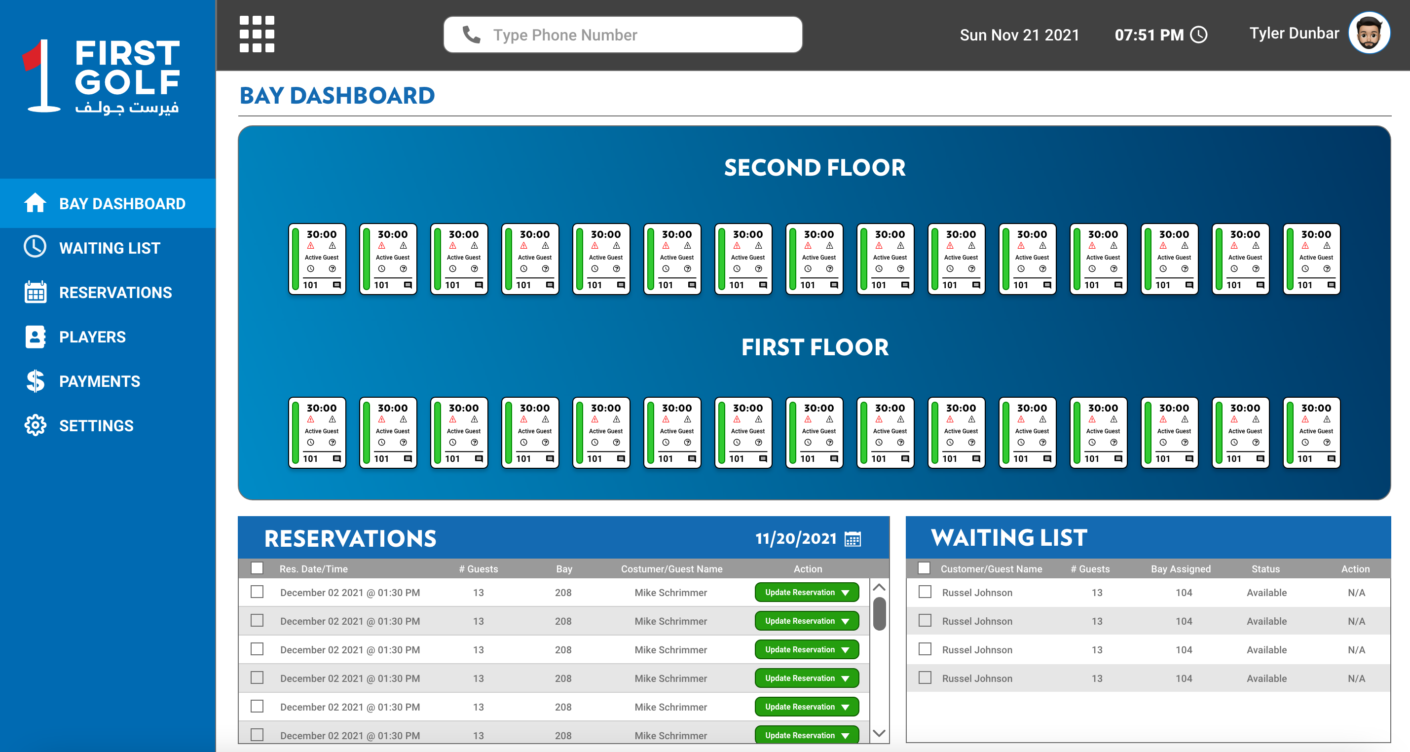
Venman 2 First Design Concept - Built in Figma
Venman 2 Final Design - Built in Figma
Improvements in the Second Version
One of the challenges our client faced was the readability of bay cards associated with each bay. These cards were crucial for end-users to understand the current state or mode of the bay. However, the initial design relied heavily on icons, which proved to be confusing and difficult to interpret. To resolve this issue, we decided to replace the icons with words and colors that clearly represented each bay state/mode. This change significantly improvedthe readability of the bay cards, leading to a better user experience.
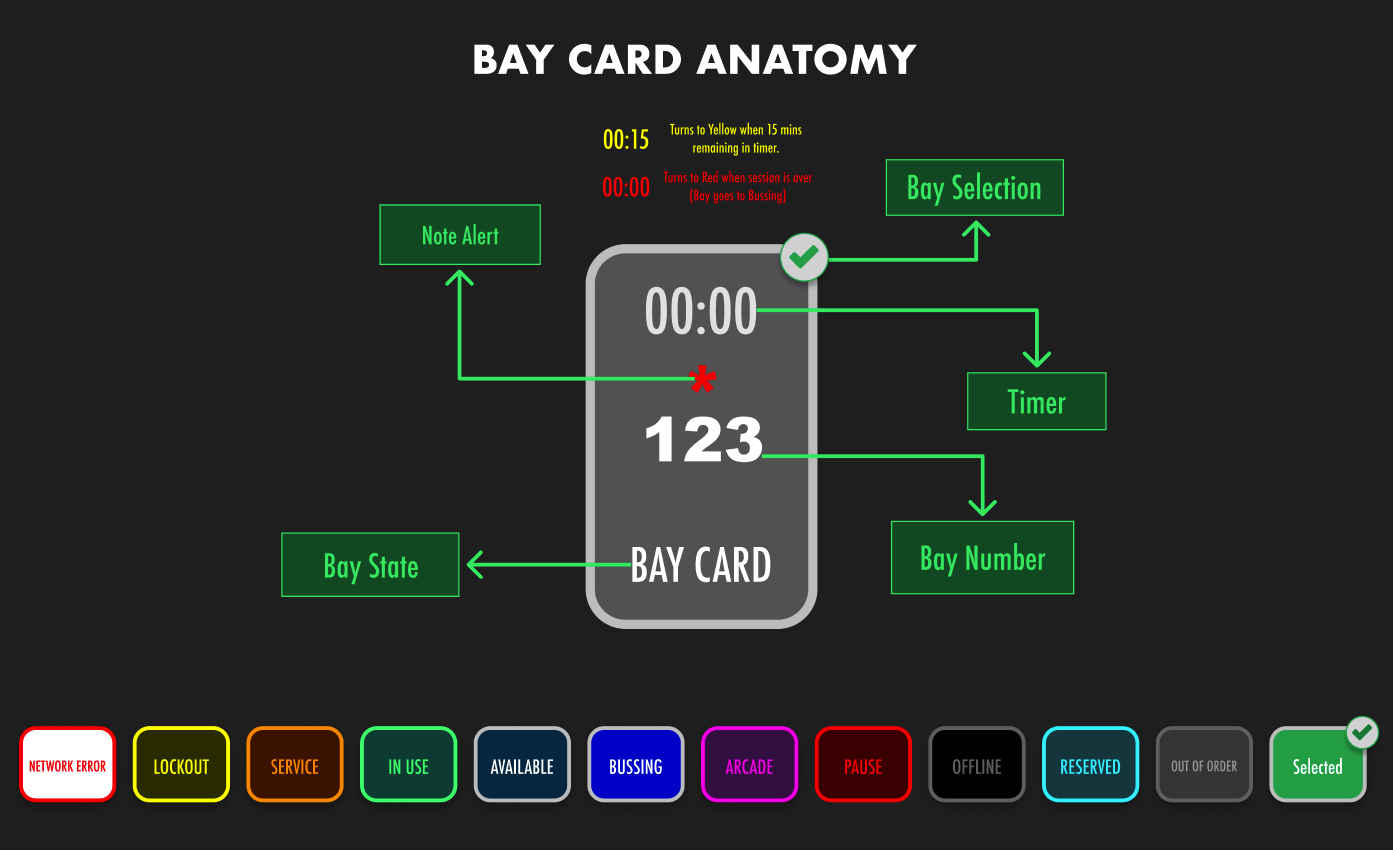
Venman 2 Bay Card Redesign
We also ensured that the second version addressed the specific pain points of our users. For instance, we improved the reservation management system to prevent overbooking, provide real-time updates, and optimized the waitlist management for walk-in customers.
This video demonstrates how to assign a customer to an available bay.
Enhancing Bay Selection and Management
Another issue that our client encountered was the difficulty in managing multiple bays simultaneously. To streamline this process, we introduced new features that enabled users to select and manage multiple bays at once. These features included the ability to select an entire floor or use multiple bay selectors.
By implementing these changes, users no longer had to assign the same customer to each bay individually, saving time and reducing the potential for errors. However, one requirement is that the chosen bays must have the same state.
This video demonstrates how you can assign a customer from the waitlist to their preferred bays.
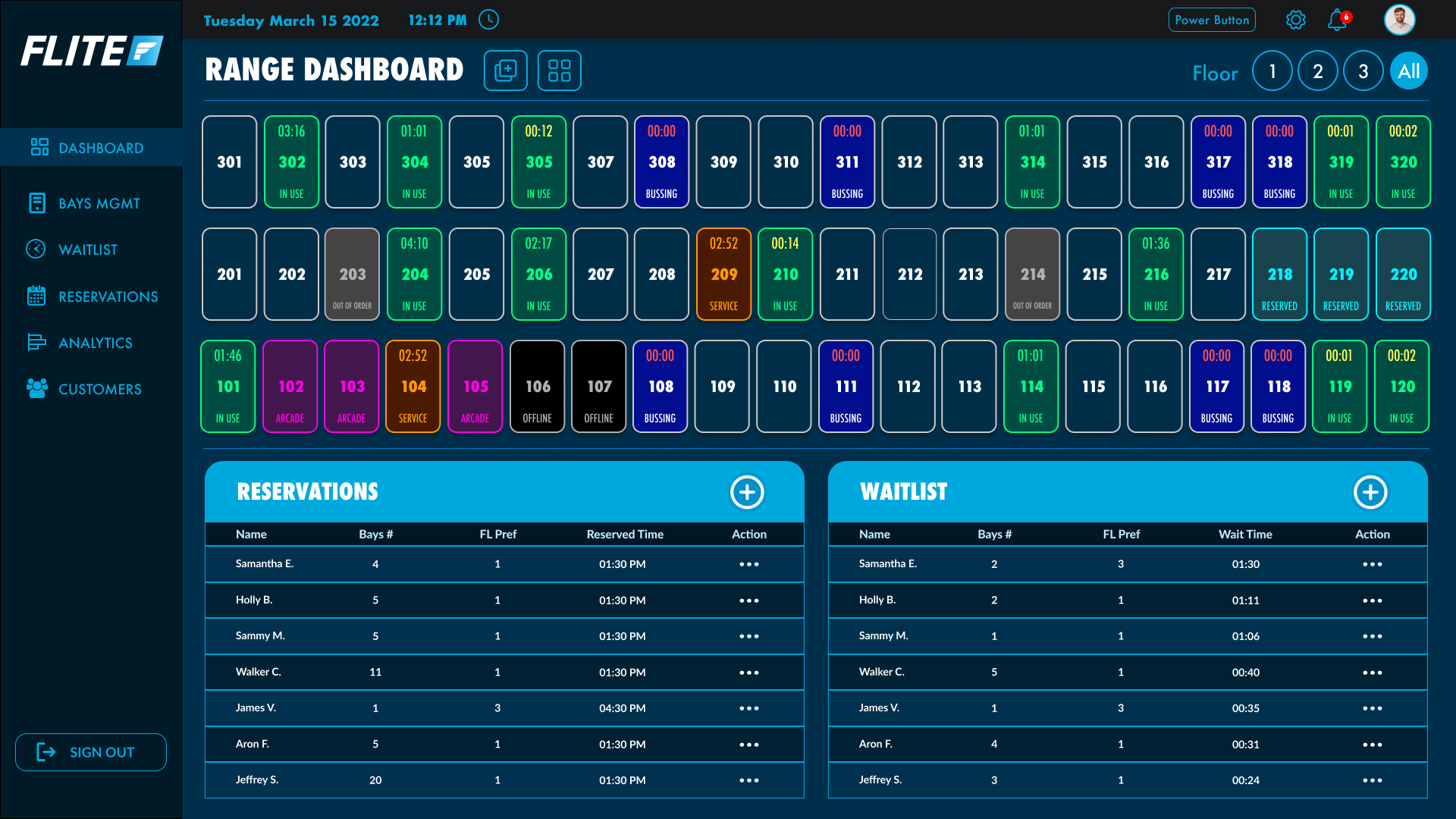
Organizing Bays by Floors and Current State
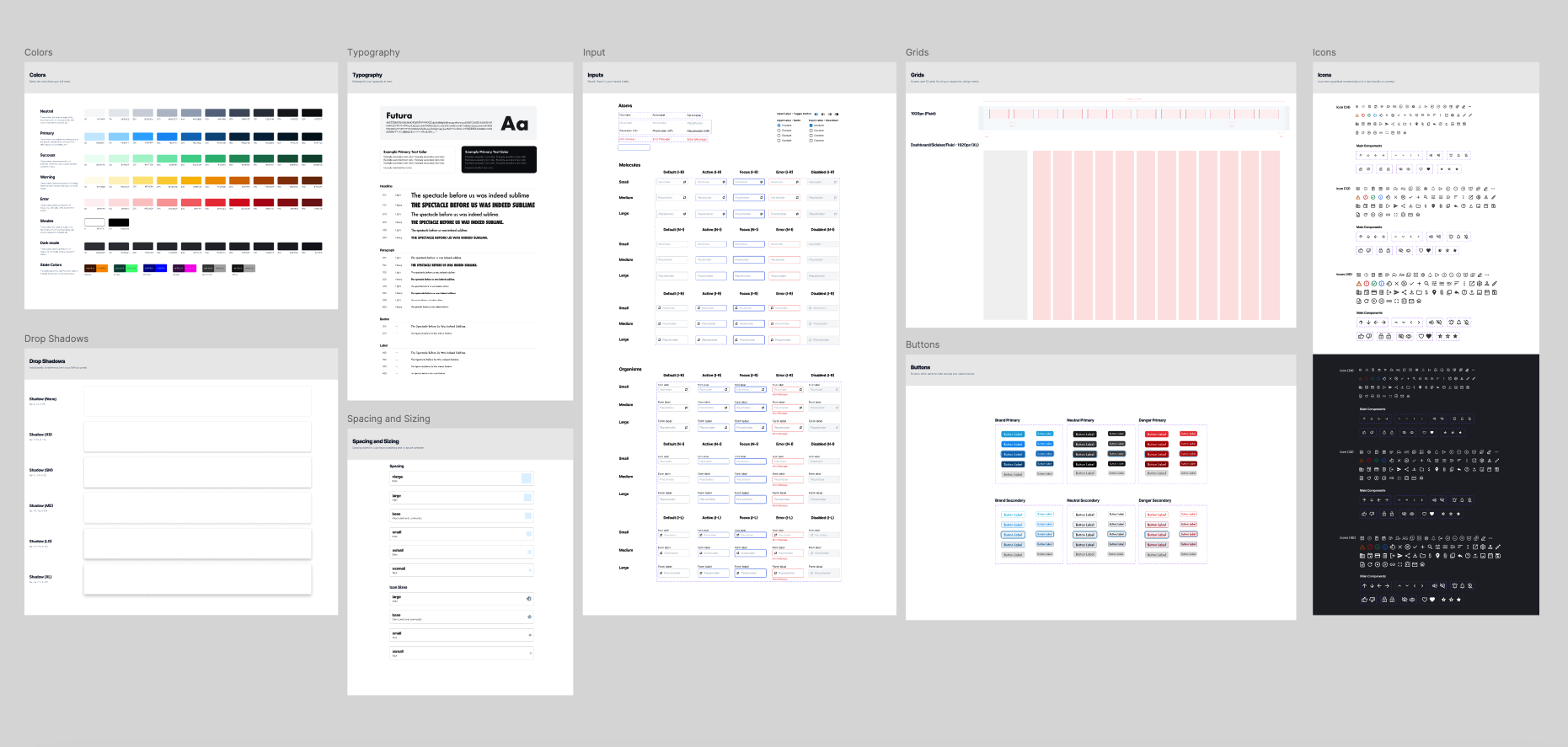
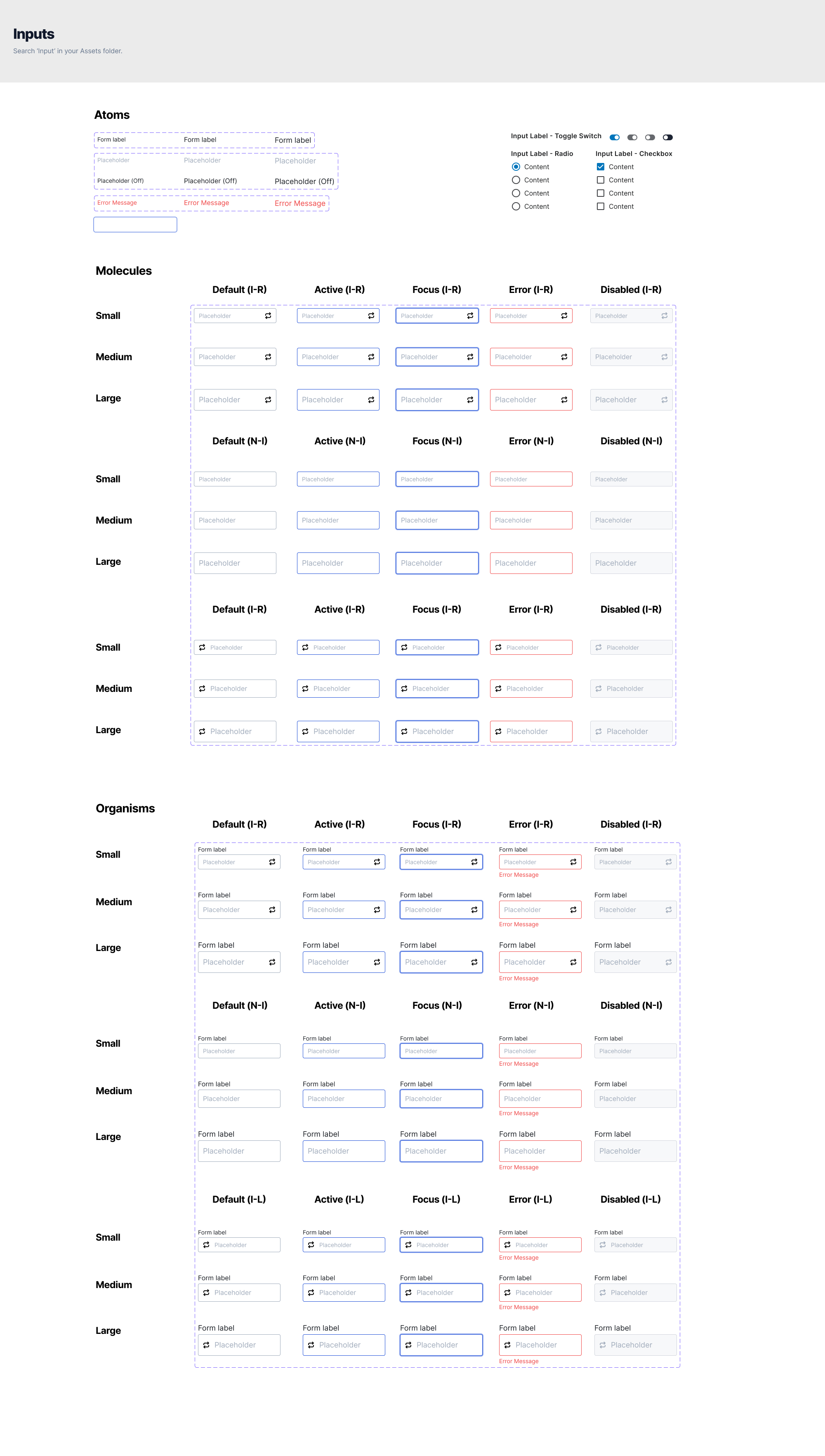
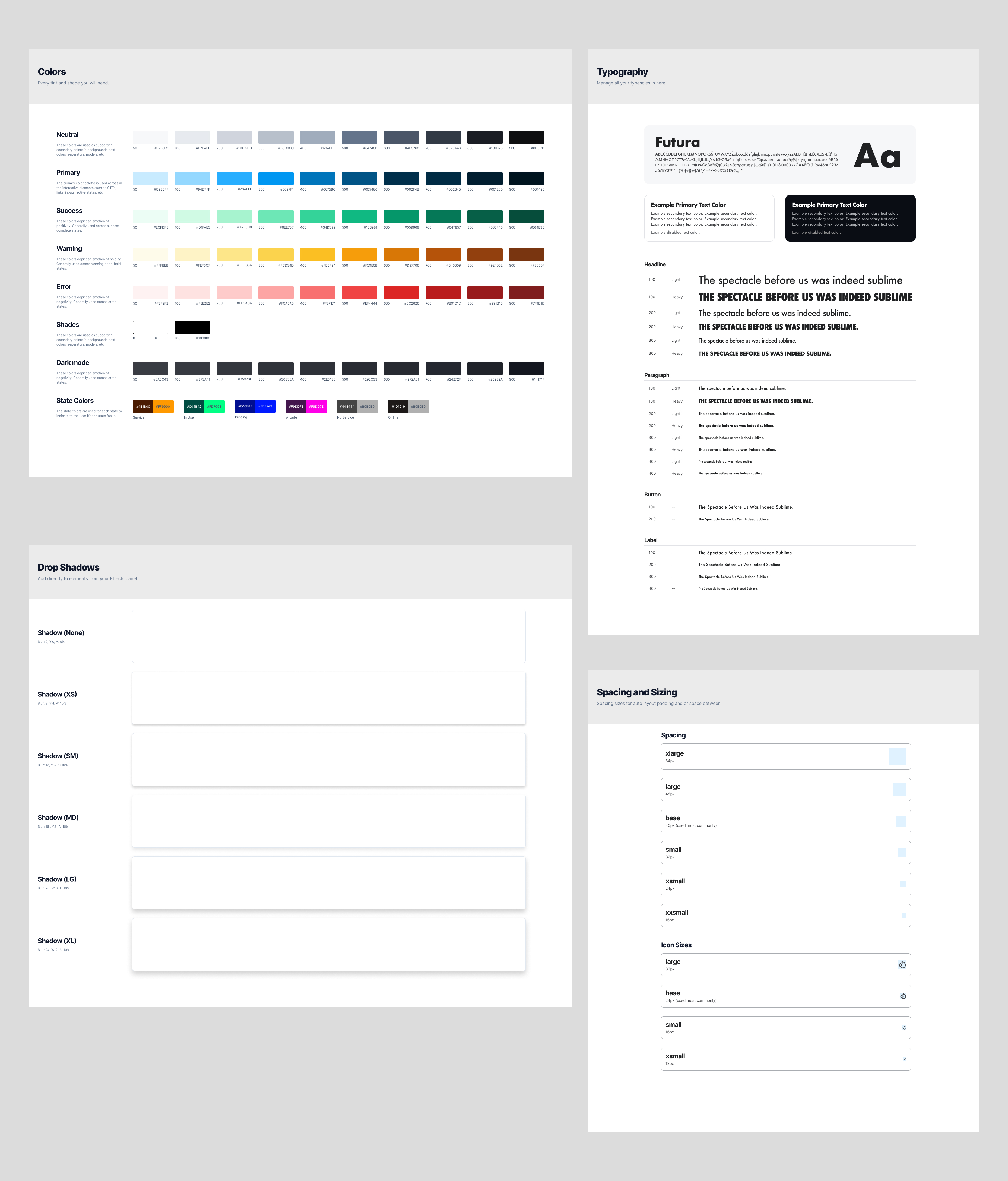
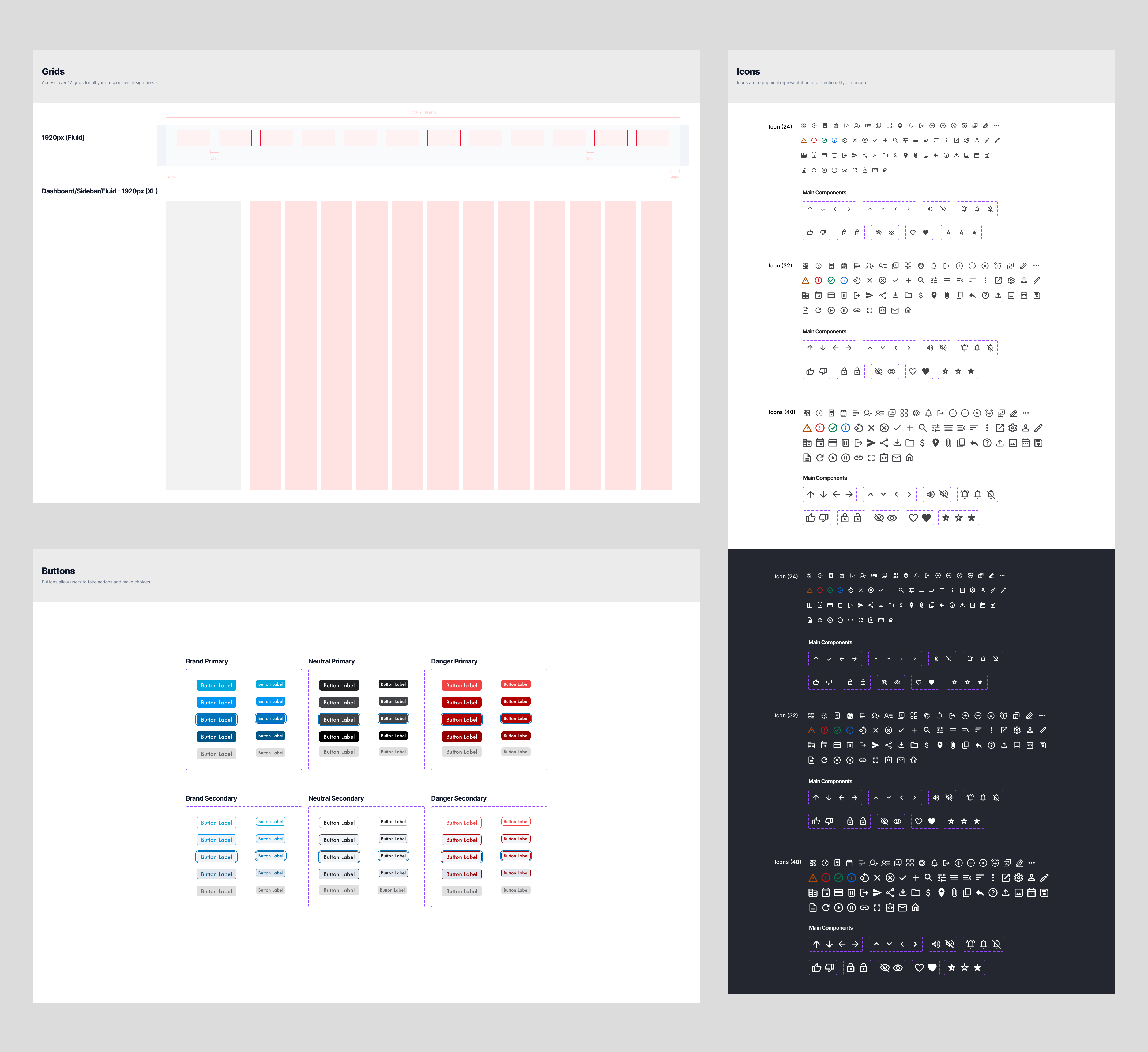
Building a design system
Next, I built a design system to maintain consistency throughout the software. This system included a collection of reusable components, guidelines, and design patterns, which allowed me to create a cohesive and professional-looking product.
Finally, as the only point of contact designer with front end development experience, I was responsible for handing off the HTML/CSS/React code to the engineering team to ensure the design is implemented correctly.
This close collaboration between the design and engineering teams helped to guarantee a seamless transition from concept to reality.
Key takeaways
Through close collaboration with our client and their team, and by conducting thorough research on potential user scenarios, our team was able to develop a golf range management system that significantly improved operations and user satisfaction.
The iterative development process, which included creating wireframes, building a design system, developing clickable prototypes, and closely collaborating with the engineering team, allowed me to learn from my mistakes and create a second, more refined version of the software that met the needs of our clients and their staff. This case study highlights the importance of collaboration, research, and iterative design in creating a successful, user-centered product.